Ergosign designs icons for Siemens Healthineers PLM-UX

Patient und Arzt an einem MRT Gerät von Siemenes Healthineers.
Client
Logo Siemens
Services
UX Design, User Research, Icon Design
Industries
Medical & Healthcare, Industry

Award-winning icon framework for Siemens Healthineers

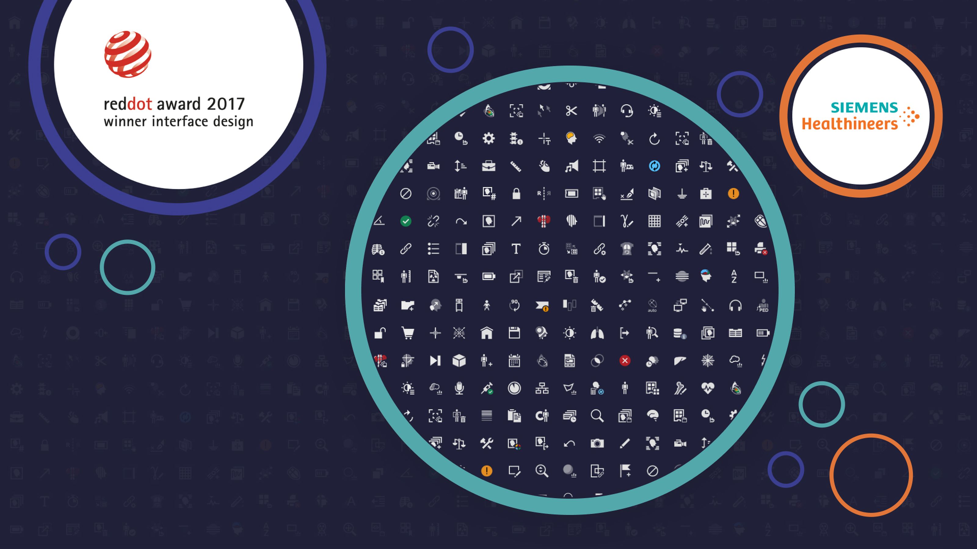
As part of a larger harmonization project across the various business areas that Siemens Healthineers are involved in, the task was to create an icon framework with a unified style and its own metaphoric system. Specific tasks such as color selection or established metaphors in medicine technology were involved and further developed.

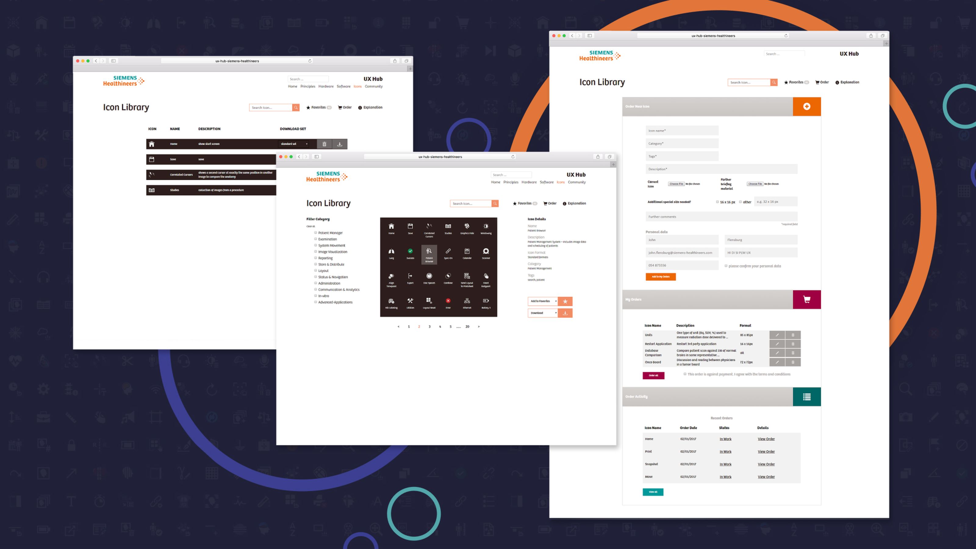
OOur work encompassed the further development of the icon style, the redesign of existing icons, and the expansion of the icon collection by establishing new metaphors. Another part of the project was conceptual work on an icon database and the icon library to coordinate and simplify icon management.

Icon Library & Styleguide for over 1.000 icons

The starting point

Up to now, over 1.000 icons have been developed within the icon framework. Working with the central department for UX and design at Siemens Healthineers, an effective design process was developed, and the icon design itself. At the same time, the style guide was also expanded and refined. We created wireframes as the foundations of the internal icon library, the central starting point for any icon. The newly developed icons stand out with a clear, two-dimensional, and geometric style that is monochrome, highly specialized, and easy to understand. Established metaphors were applied across various areas of business and products, allowing a simple exchange between systems and, therefore, the fast learning of new applications.

Together for the best metaphor

Our approach

For the icon framework, we worked closely with the central UX and design department at Siemens Healthineers, PLM-UX, and specialist departments or business lines. We developed suitable metaphors for challenging, specific application contexts through joint workshops and intensive induction into specialist medical departments. Together, we came up with an internal process that optimally synchronized PLM-UX, designers, and application specialists from Business Lines. But our project didn’t end with the icon design: we will continue to support PLM-UX in developing new icons and the icon framework.

Prize-winning: Red Dot Award 2017

The solution

In October 2017, the Siemens Healthineers UX Icon Framework was awarded the Red Dot Award 2017: Communication Design in User Interface Design, Icon Design. The international Red Dot Award is a seal that recognizes impressive and high-quality design. A total of 8,051 projects were put forward in 2017.

Ergosign significantly contributed to Siemens Healthineers now having a unique, prize-winning icon framework. Ergosign team’s spirit was always good. Thank you, Ergosign, for this great collaboration!
Jonas VollmerDirector User Experience DesignSiemens Healthineers

Siemens Healthineers by Siemens AG

About the client

At Siemens Healthineers Dieser Link führt zu einer externen Seite , we want to make healthcare providers succeed in an ever-changing healthcare industry – by helping them deliver better outcomes at lower costs. This purpose drives our focus: to lead the transformation of healthcare together with the ones delivering it. Being a leading global healthcare company, we at Siemens Healthineers are continuously developing our portfolio, from medical imaging and laboratory diagnostics to adding managed services, consulting, and healthcare IT services – as well as further technologies for therapeutic and molecular diagnostics.

Ready for the next step?

Let's shape healthcare and medical technology together.

We look forward to hearing your ideas!

Our privacy policy can be found here.
Anna Boeni

Anna Böni

Lead Business Developer