Ergosign’s design and development team worked closely with Yippie’s web team: agile, interdisciplinary, and collaborative – with real users at the center and accessibility as an integral part of the development process. Together, we built the design system to be accessible from the ground up.
A design system built accessible from the ground up
Colors, contrasts, semantic structure, hover states, and tab order were all precisely defined. In practice, this meant prioritizing clear, single-colored interactive elements. To guarantee ideal contrast, gradients were minimized and only used in backgrounds.
Forms & navigation without barriers
Accessible navigation of the website and order forms is ensured through well-thought-out keyboard control, focus handling, and precise ARIA labels. Hierarchies (H1, H2, etc.) are visually appealing, semantically consistent regardless of presentation, and technically correct for assistive technologies.
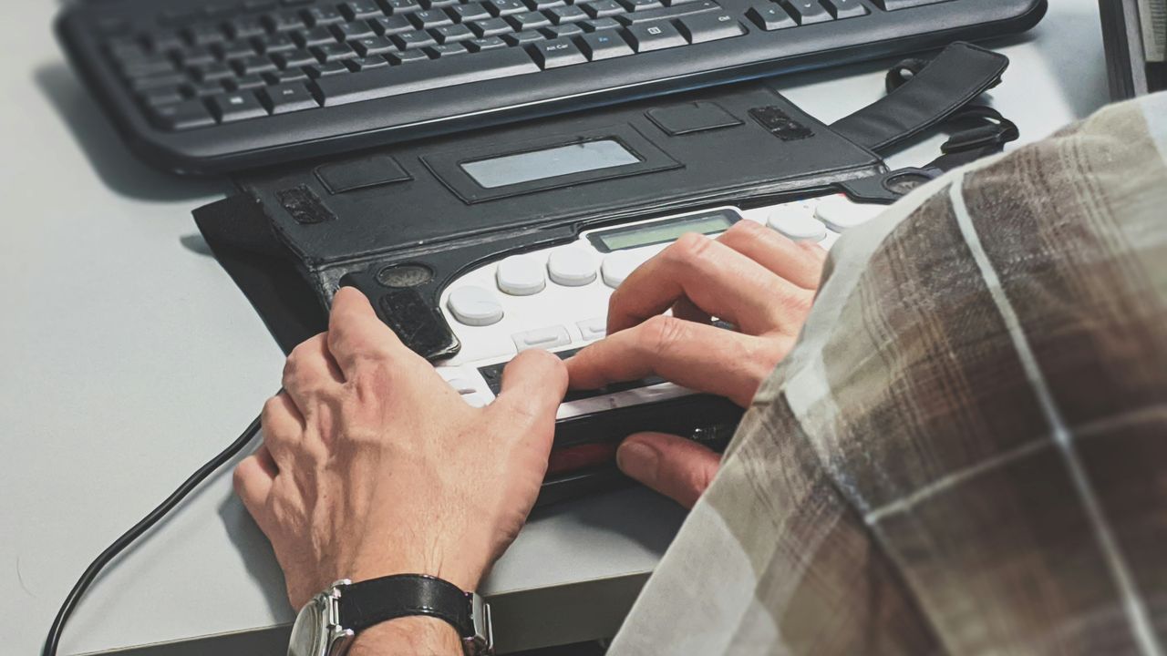
Handling error messages in forms and implementing them accessibly can be tricky. In our case, a design review with a blind user helped clarify open questions and led to an optimal solution.
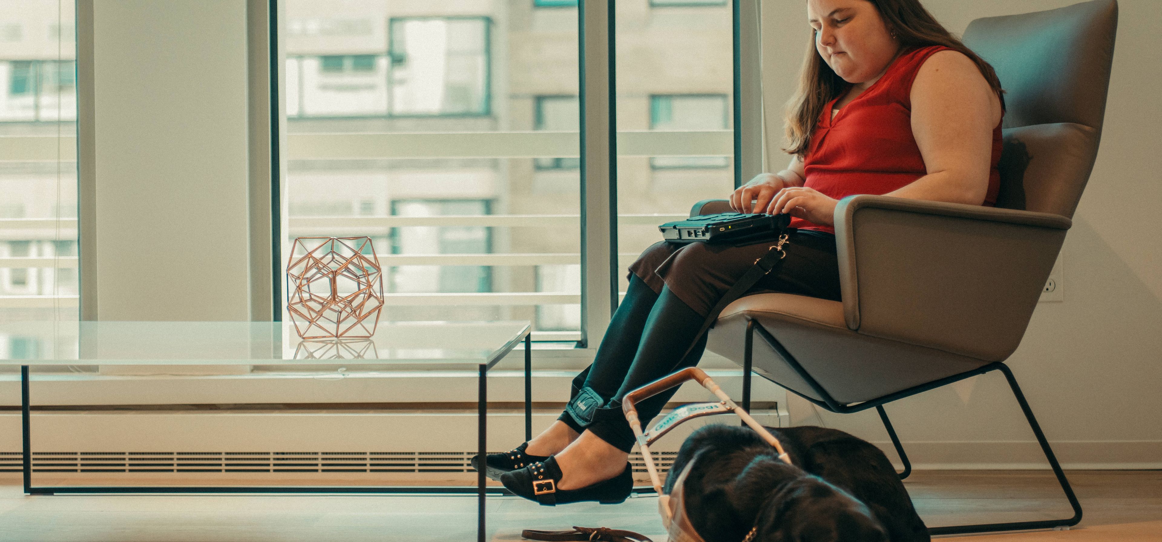
User testing with real experiences
Accessibility only comes to life when real perspectives are included. That’s why usability testing was a core part of the Yippie project. Direct feedback from people with different impairments – such as a blind user testing the ordering process with a screen reader – proved invaluable. These insights helped us identify potential stumbling blocks early and implement precise solutions. The result: a platform that truly works for all users in everyday life.


)
)
)
)